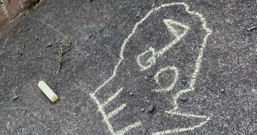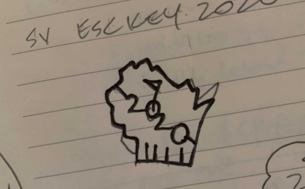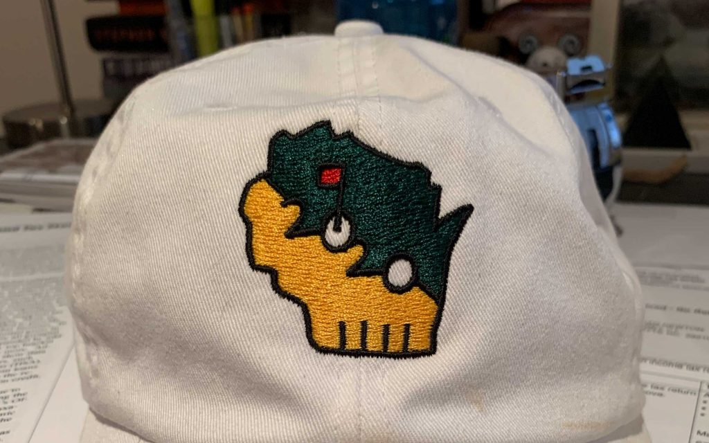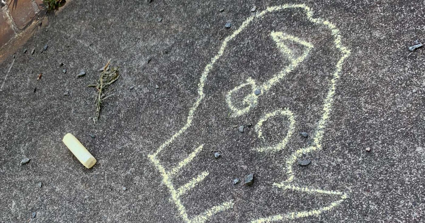
The 2020 trip was cancelled as viral loads climbed through the summer, but the hat had already been fabricated. The design predated the pandemic by just a few weeks, and at the height of the uncertainty around morbidity and everything else in society, using the “jolly putter” device seemed like perhaps a mistake. I wanted the logo to be a naive elaboration on the timeless Masters “green” concept.
Here we’d use Wisconsin’s state shape—which is up there for fun state shapes—with Sand Valley as the pin position. As with any trip logo, ideally it marks a place in time too. The color system was arbitrary—the only no-go being Augusta’s BP-esque saturated yellow and green–but Packers colors weren’t far off.